So you're on the third page of a little course in photography, and you haven't seen one picture yet. OK, let's fix that.
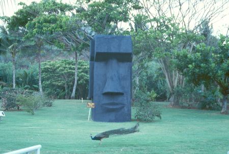
Not particularly impressive, is it? Just a typical snapshot. What's wrong with it? All sorts of things. First of all, it's not even obvious if I was trying to take a picture of the peacock or the stone head. In the foreground there's a distracting bit of handrail. There's an illegible sign next to the head. It's just not very interesting.
Here's another secret. It's the second most powerful photography tip I know after culling. Ready?
Get closer!
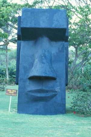
That's a bit better, isn't it? Now it's clear I was after the stone head. A lot of the distracting elements from the periphery are gone, yet there's still some context. Although the sign is still illegible in this little scan, it's fine on a typical 4x6 print. All that just for getting closer to my subject. That's a pretty powerful trick. All it cost me was another ten seconds and an extra frame of film (film is cheap!).
Note that I turned the camera sideways to match the shape of the head with the shape of the picture. This helps for a lot of reasons, some of which are discussed later. For now, I just want to point out that it let me get closer to the subject than a typical horizontal shot would allow.
If your browser is wide enough, look at these two shots side by side.
Exercise:Guess what percentage of each photo is covered by the head?
Answer:10.3% and 43%. Surprised? Only 10% of the first photo is dedicated to the subject! That means 90% of the photo is about something else! The second photo is a lot better, but the subject still less than half of the image. I bet you guessed higher. There are perceptual reasons for that which we'll discuss later.
One of the beauties of the get closer strategy is that you can apply it more than once. Consider this picture:
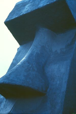
Wow, that's really close. In fact it's so close that you can no longer see the entire head. I cut off the forhead, the ear, the mouth, and the tip of the nose. Almost sounds like I'm breaking a rule. Actually, I'm taking a risk, because I know that extra shot is cheap and it just might turn out to be a good picture. I'm purposely trying to see if I can get too close. It turns out, that it's really hard to get too close.
The visible portion of the head occupies 90% of this photograph, (and the remaining 10% is distraction-free negative space to help define the shape). Some people would say that this last example is too close and would prefer the previous shot. Personally, I like this latest one, but that's just a matter of taste. I think we can both agree that either one is better than the first. And giving myself three photos to choose from improves my chances of having something better than that initial shot.
This close shot is no longer an objective picture of the stone head. It's more intimate. By getting in close, the subject isn't the head, it's the eyes, which let's us get a sense of the brooding attitude of this big stone head.
Getting closer has deprived us of context for scale. The first shot had the peacock, the sign, and the trees which helps give us perspective and scale. The third shot has lost all that. But by overfilling the frame (and angling up and using a vertical format) makes a more striking sense of the enormous size. (In fact, this photo exagerrates the size.) I'm not saying it's wrong to include known elements for scale. I'm just pointing out that context is not the only way to convey size.
Some people complain that getting this close takes away other bits of context that they wanted to remember. The jungle setting and the peacock are part of the same memory. It is possible to take a good photograph that combines lots of individual elements. But it's hard to do that well. My answer is to remember that film is cheap (surprise). I'll take a good picture of the head and one of the jungle and one of the peacock, and put all three on one page in my album (or on my web site or in my slide show). The sum of the parts can be more than the whole.
Even if you prefer the second shot, you wouldn't be sure that it's your favorite unless you had the third one for comparison. In one sense, the third shot isn't a waste, because it helps confirm that you like the second one. Give yourself choices.
Film is cheap! In all, I took about ten shots of the head, a couple more will pop up later in this presentation. And in reality, I knew the first one wasn't going to be very good, but I needed an example for this presentation. So I got one good shot of the head in nine tries. The fact that film is cheap gave me the freedom to try all those shots, and the principle of getting closer gave me something to try.
It's really easy to say get closer, but it's harder to do than you might think. Let's find out why...
The Viewfinder and the Eye